9 January
8 UI/UX Best Practices for the Successful Performance of the Website
Design
Web apps
min. read
Introduction
Focusing on the user while creating an interface for a website is critical, but to prepare a highly engaging page design, many more factors need to be considered. Digital experience plays a huge role in brand perception and is also responsible for increasing ROI for the business.
Today, we will provide 8 UI/UX best practices that let graphic designers prepare compelling visuals.
1. Visual hierarchy of elements
A hierarchy of graphic elements is a kind of attention guideline. It should navigate a customer through information and affect the design’s usability. By influencing the order in which the human eye perceives content, it determines the validity of it. Thanks to the visual hierarchy, each element can be laid out logically – the viewer should be able to decide where to start and what to look at later. Let’s skip into some rules.
We can distinguish 5 key principles for visual hierarchy in UI/UX:
- Size & scale
The larger the element, the more attention it will attract, but this principle also goes a rule of the proximity of elements and their scale about the rest. It is essential to place related components closer together and vary their sizes to cause logical connections. Strategically adjusted by size and scale, UI elements can lead to faster absorption of information, which, in fact, also affects the user journey.
Example of use: Imagine that we design a page for a new software product. Visitors should first see the product’s name – we should use the largest font size, which would be at the top of the visual hierarchy. Below the name, we should have a tagline or a brief description presented in smaller letters than a product name but still more significant than the rest of the text on the page. The next element will be a CTA button – quite large and in contrast to the background color (it should stand out but not be pushy to the heading and subheading. Then, we have additional information like product details, testimonials, etc., which are smaller than the three elements discussed above but not too small to avoid missing out. The smallest part should be footer details, leading to less critical information – terms, policy, and social media links.
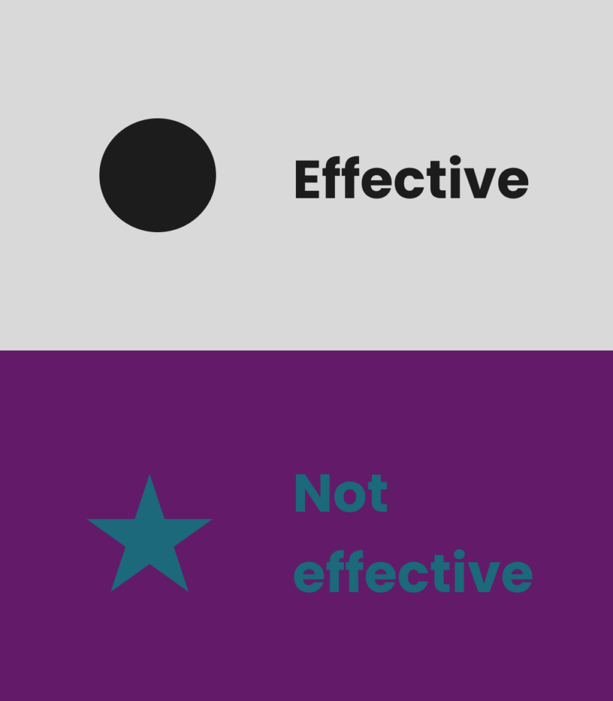
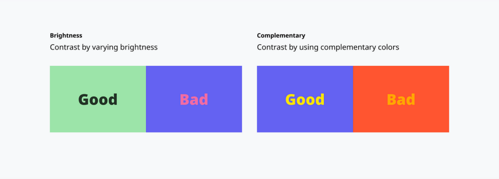
- Color & contrast
Bright and saturated colors usually draw our attention, while dimmed colors subside them. If you want a particular element to be the most noticeable, use a high contrast to the background. Thanks to colors, there is a huge opportunity to create a visual differentiation between various levels of information importance. It’s one of the simplest ways to highlight what is crucial for the site.
Example of use: Looking at the site’s navigation menu, contrasting colors for selected or active pages is beneficial to know a user’s exact location on the page. We can also say that choosing a color different from others will attract customers’ attention in the context of the CTA button mentioned above. For example, if your site’s color scheme is purple, you can choose an orange for CTA.
- Typography
If you want your content to be more readable, use large or bold letters. Navigating through the page can be performed thanks to the use of various sizes and weights of fonts.
- Space & texture
Spacing can highlight or downplay particular elements of the layout. Effective grouping helps in perceiving a proper sense of order or importance.
Example of use: Smaller icons or images of products can be presented contrary to the bigger one – maybe a product that a company wants to promote the most. Thanks to it, a customer subconsciously knows this is a featured product and may be more eager to buy it or at least become familiar with its description. Also, using a negative space between products can guide a user’s eye – key elements can pop up. Such action prevents the design from feeling cluttered.
You can use textures to distinguish interactive elements like buttons or links. For example, a CTA button could have a raised texture to suggest it can be clicked, or a textured hover effect could be used to indicate a link. Still, these are just a few examples – the actual application of each rule should depend on the specific goals of the project and the characteristics of the company for which you create a design.
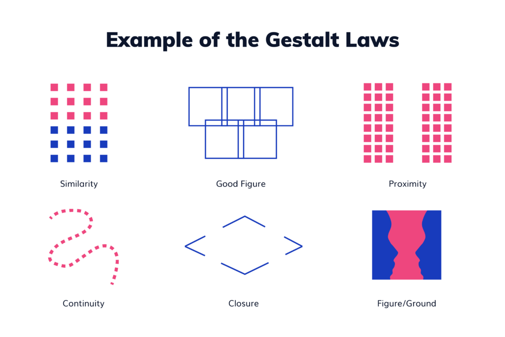
- Gestalt rule
This principle relates to leveraging human perception – everybody perceives some elements by intuition, which is an innate characteristic. Following the Gestalt rule may contain multiple uses of particular objects, using arrows/icons/underlines, combining related elements, using a specific distance between components, and following after-composition lines.
One more thing when we stick to the hierarchy – remember about information architecture – it’s a rule of organizing content through the page, and based on this, mixed with setting up the visual hierarchy, you can prepare a wireframe to validate structure and functionalities (a representation of layout for each screen).
2. Focus on the user
This UX design principle is the most fundamental for other rules. Something can look great from a designer’s point of view but cannot be appropriate for the user. Getting into a potential customer’s shoes would be best to create a layout well. How to do that?
Defining a user’s pain points will be a ground-breaker. Knowing the target group means that you can design as closely to people’s preferences as possible. It’s all about humanizing the digital journey. Thinking about the way users will interact with the page provides you with clues. The UI/UX designer should be focused on user-product interaction. A great concept may be adding some human touch to the design, such as micro-reactions, visuals, etc. – it helps to create a tiny, emotional bond and a sense of understanding (remember, though, that this should also be adapted to the specifics of the branch).
3. Simplicity
Simplifying the user’s experience means creating interfaces that are easy to use and with minimal complexity—fewer elements and highlighting what is critical results in an immediate improvement in usability. In design, the result of gaining the user’s attention is desired, so too much input will ruin it.
The user is quickly and easily distracted these days, so keeping the design logical for the viewer and not requiring thinking is the best solution. This should be done progressively and contextually if you need to convey a lot of information. User actions need to be quantitatively limited in terms of simultaneity. This helps to achieve a more straightforward user journey.
4. Accessibility
Don’t forget about the open-mindedness for inclusivity. Accessibility ensures that those with disabilities can also benefit from using your website.
As a designer, you should take into account such factors as:
- font size
Text should be resizable without loss of content or functionality. Fonts should be readable and legible, considering users with dyslexia or other reading difficulties.
- color contrast
The design should not rely solely on color to convey meaning, as this can be difficult for colorblind users to understand. The contrast between the text and background colors should also be high enough for people with low vision to read.
- keyboard navigation
All functionalities should be accessible through a keyboard for people who can’t use a mouse.
- screen reader compatibility
Alternative text should be provided for images that convey meaningful information, benefiting those who use screen readers. Icons should be intuitive and universally recognizable.
At first glance, you may think that focusing on creating pages accessible for everyone is not possible due to combining many factors. Still, if we give it more thought, we see that improving the fundamental design and adjusting it to be more accessible goes hand in hand with concepts. For example, considering those with some visual impairments means we will simplify our project, leading us to a better user experience.
5. User control
This part is strictly connected with focusing on the user, which we mentioned in one of the above points. The person viewing a page should feel in control – that nothing will be clicked by mistake, accidentally missed out, or misunderstood. Adding relevant controls to navigate yourself, functional buttons, or shortcuts prevents visual clatter and feeling disoriented. The visibility of system status should also appear. People need to know what is happening constantly, so please remember to give feedback on their actions.
The engagement with the page will be more robust when the user feels confident in navigating the site. This, of course, does not mean giving complete control over the whole site. Remember that depending on the type of website you are designing, functionalities should work for both groups of users – those who are inexperienced with navigating pages and those who recognize everything intuitively.
6. Minimize cognitive load
Cognitive load in graphic design refers to the mental processing power required to perform actions connected to using the website or application.
When designing interfaces, minimizing cognitive load is critical to make it easier for users to better understand and interact with the interface. High cognitive load can cause errors, slow interactions, frustration, and resignation from using the page. On the other hand, a low cognitive load ensures a more enjoyable user experience. How to achieve that?
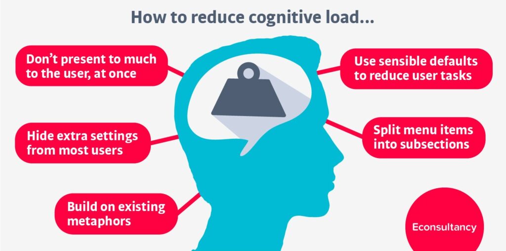
Consider factors such as interface complexity, the amount of information presented, the need for users to remember particular details, and the level of user control. Don’t forget to eliminate the necessity of re-entering personal data every time the user buys something or logs in. Remember the rule of recognition vs recall, which relates to reducing minor information and the need to memorize – it will significantly decrease the possibility of users getting angry.
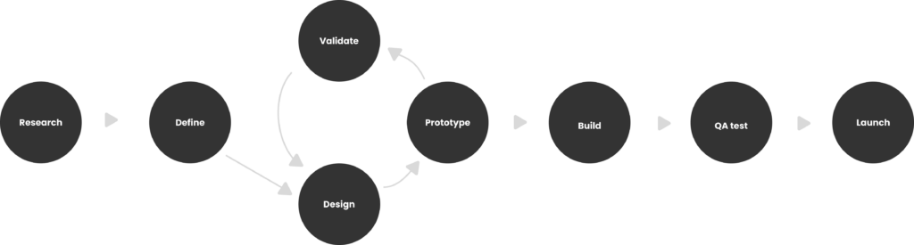
7. Usability testing
An essential part of preparing websites is testing them. It’s not something that should be organized close to the release date, but it must be run throughout the whole UX design process – from prototyping to launching. If you prepare the page without testing it before, it is likely that something will not work. Each graphic design focused on the user needs validation and measurement of how it follows the crucial UI/UX principles.
Interviews, A/B tests, eye movement tracking, session recording, and moderated/unmoderated usability tests are examples of how you can perform testing. Thanks to them, we can find out where the possible difficulties are, what particular aspects of users’ behavior look like, or if there is something to improve.
The designing process should also be continued after the release of the page – gathering feedback and constant iteration is necessary.
8. Context is a gate for understanding
A great UX design approach also refers to keeping in mind the context when designing, which means, in this situation, paying attention to what devices your target group will use to interact with your designs.
Contextual designing is also about adjusting it to the changing environment where users interact with a page – it could be a quiet place like their own houses. Still, it could also be a car while stuck in traffic or an office during a lunch break when many people are passing through and talking. So, how do you bring this contextual approach to the life of your design?
Firstly, you can organize user surveys, which are a coherent part of contemporary UX design strategies. Additionally, you can test your page on yourself – try to interact with it in various locations and circumstances. If there is any place where you find your design not entirely clear and intuitive, it’s an anchor point for a redesign.
The concept of a contextual design is also known as an emotional design. Its core lies in the idea that users subconsciously want to experience pages with something like an “emotional flavor.” It means they wish to use pages that fit the situation in which they use them. Although this may be difficult in the case of considerable discrepancies in the target audience’s site use, it’s worthwhile to pay attention to such environmental factors that may improve usage.
Conclusions
Considering all these rules through which we’ve gone here, remember to always design for the users, not for yourself. Many solutions seem great when creating pages, but forgetting the crucial principles will not go unnoticed.
One thing entails the other, which is why it’s so crucial that user satisfaction always represents the principles discussed. A web development process is complex and iterative, in which feedback plays a huge role and should not be missed. Because of that, seeking engagement in the early steps of the work will help evolve your projects and guarantee their success.
Imagine how perfect fashion creations can be that are only suitable for the show and cannot be worn comfortably. If you ever feel like your page looks unique and beautiful but seems less functional than you wanted, remember the above comparison, and you will surely get an idea of how to redesign it.
Author


Technical Content Writer /
Kinga Kuśnierz
About prog
Founded in 2016 in Warsaw, Poland. Prographers mission is to help the world put the sofware to work in new ways, through the delivery of custom tailored 3D and web applications to match the needs of the customers.
SIMILAR POSTS
How to Achieve CG Photorealism – Basics & Tips
3D
Design
min. read
Deploying Nginx as an API Gateway – Tips & Functionalities
Programming
Web apps
min. read
Fixing Shadow Noise in Unreal Engine 5 – a Guideline with Practical Tips for Lumen and Ray Tracing
3D
Design
min. read
Let's talk
I agree that my data in this form will be sent to [email protected] and will be read by human beings. We will answer you as soon as possible. If you sent this form by mistake or want to remove your data, you can let us know by sending an email to [email protected]. We will never send you any spam or share your data with third parties.
I agree that my data in this form will be sent to [email protected] and will be read by human beings. We will answer you as soon as possible. If you sent this form by mistake or want to remove your data, you can let us know by sending an email to [email protected]. We will never send you any spam or share your data with third parties.